Using a data driven approach to improve the mobile app NPS by 28% over 6 months
RESEARCH - PRODUCT STRATEGY - USER EXPERIENCE
Improve sentiment for the mobile app experience
Recent NPS results suggests a decline in sentiment amongst carers towards the mobile app. Not only is this having a negative impact on Birdie’s reputation but the app was not enabling carers to deliver the best care possible.
Improve the way that Birdie tracks performance across the product
Create a benchmarking framework that can be used by other teams across the business in their respective domains.
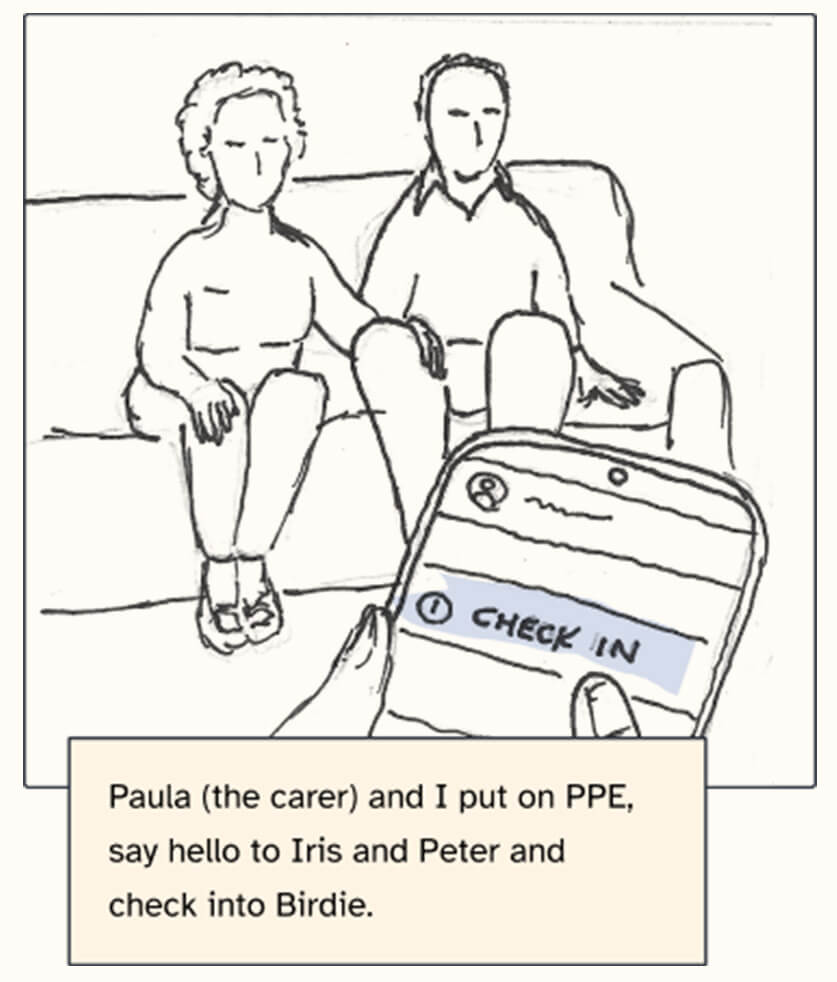


Initially, scheduling research calls with carers was extremely challenging due to their tight schedules and frequent no-shows. The rate of interviews was barely one a week to begin with. To address this, I created a feedback community that carers could sign up to through the app, offering a £10 Amazon voucher for a 30-minute call to willing participants. This approach quickly provided a steady stream of carers to interview, averaging 5 calls a week with over 1,000 carers signed up to the community.
I conducted discovery workshops with my team to help us identify key areas for improvement. Beyond technical performance issues there were a number of “perceived performance” issues that could be solved through UX tweaks.


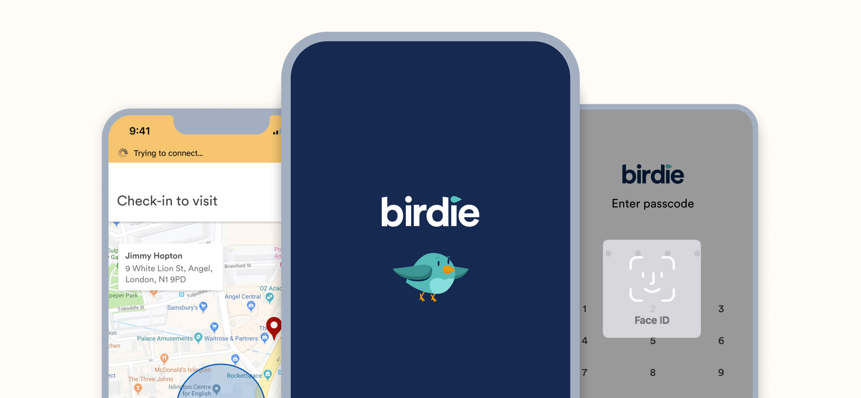
Improved loading experience
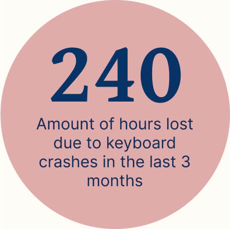
25% of users encountered delays of 30 seconds or more when opening the app from a cold start. Having no visual feedback on the loading screen led to perceived unresponsiveness. By introducing a loading animation and text, we reassured users that the app was loading, thereby reducing the perceived waiting time.
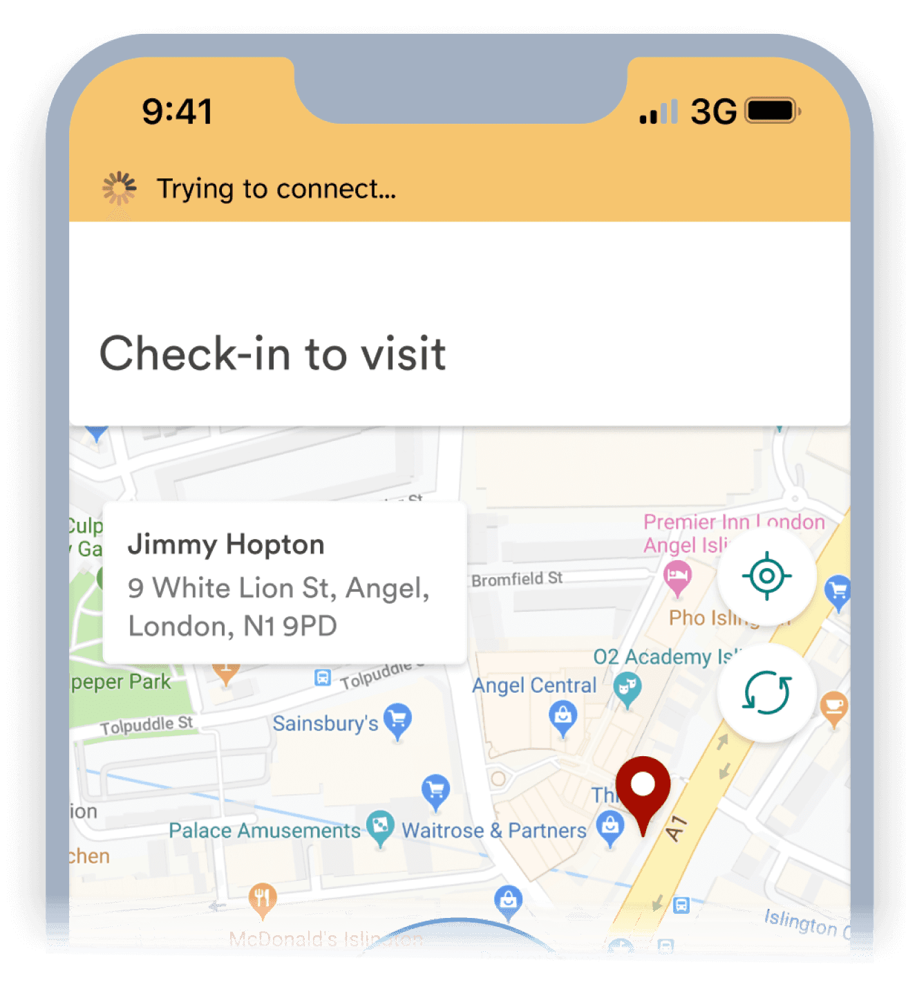
Improved connectivity messaging
20% of carers face slow loading times in low signal areas, often perceived as the app crashing. We added a "Trying to connect" banner to let the carers know that the slowness was due to poor signal. This feedback gave transparency and reduced uncertainty for carers.

Easier app access
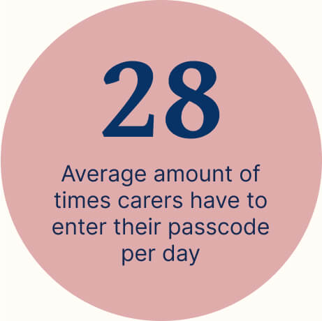
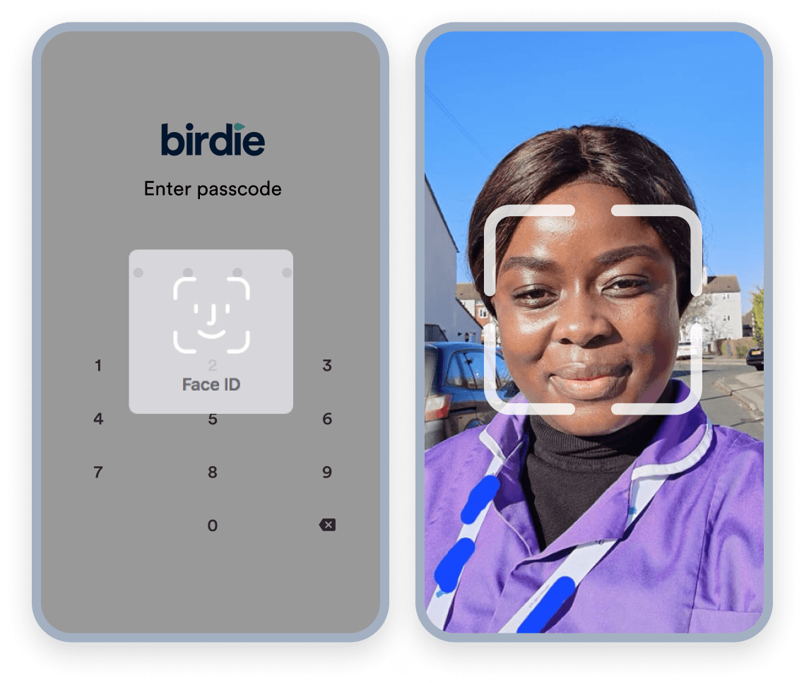
On average carers were having to enter their passcode 28 times a day which is incredibly frustrating in an already stressful working environment. By increasing the auto-lock time from 5 seconds to 1 minute we were able to reduce the average amount of times to enter the passcode to 11 times a day. We’re currently looking to reduce that further with Face ID login.
By utilising tools such as Amplitude to look at user behaviour and app performance metrics we we’re able to make more informed decisions as a squad. This process required close cross functional collaboration which helped to set the standard for how Birdie uses data to make product decisions.
To help encourage other designers to take a more data driven approach I created an “Elevating design with data” guide.
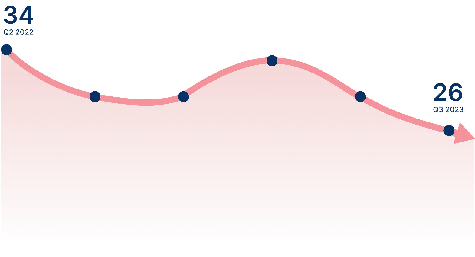
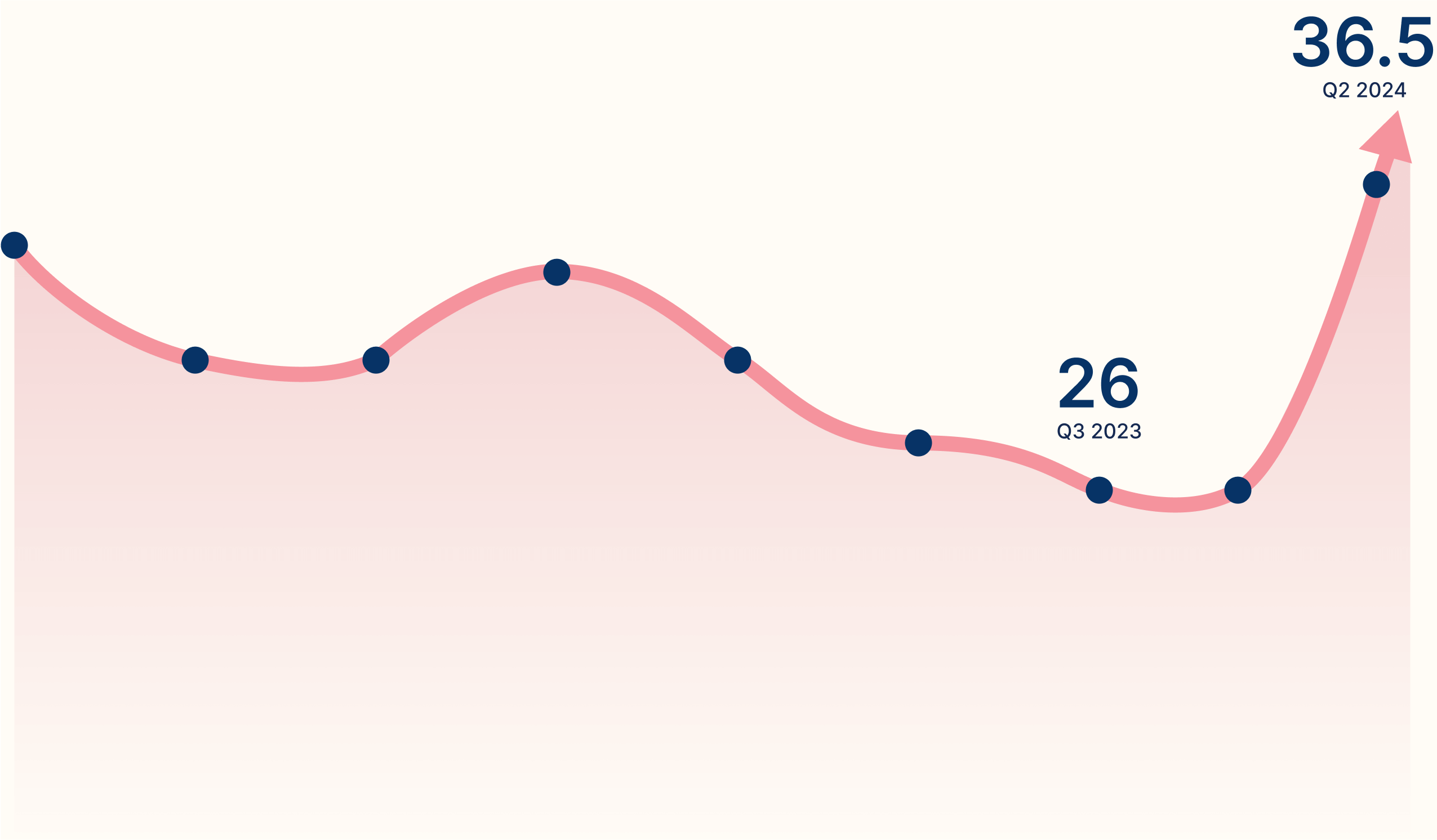
After the performance improvements and UX updates had been made, it took a further 6 months to see a change in our NPS. However, it did eventually improve by 7.5 pts (28%) 🎉
Carer messaging centre
Launch of new carer messaging tool, unlocking key MME accounts and achieving 75% adoption across eligible users

Workforce experience vision
Crafting the strategic direction for the new Workforce Experience domain
Made in Framer by me with
Back to top